SHANSHE
Brand Strategy
Brand Identity
Visual Design
Website Design
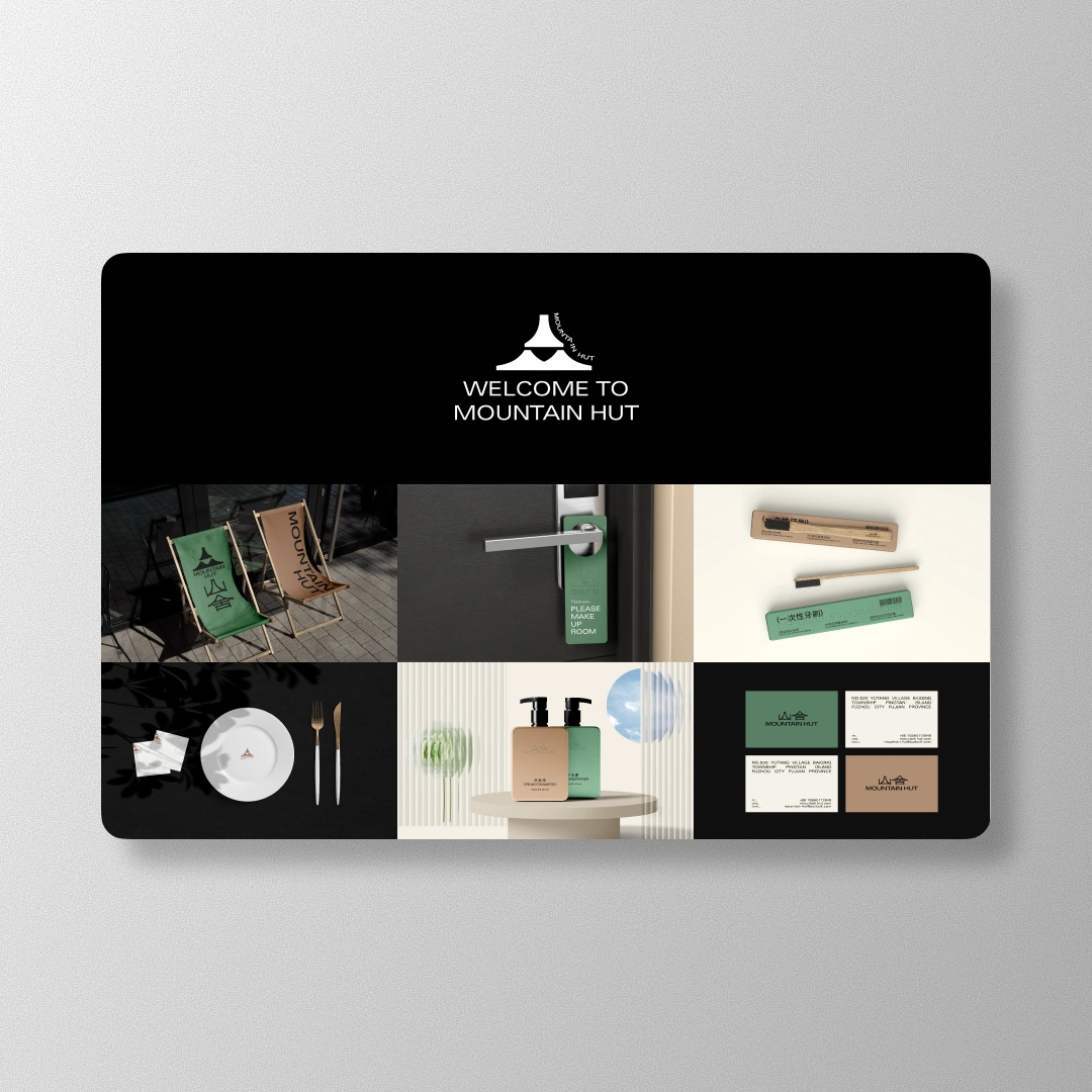
SHANSHE (山舍) Mountain Hut is a small homestay on Pingtan Island, built for people who need a real reset. We turned “calm, nature, quiet” into a clean identity system. A mountain plus roof mark, sand and pine tones, and simple signage that’s easy to follow.
Timeline
10 Weeks
Challenges
Most homestays try way too hard. Too many fonts, too many “cozy” decorations, and a logo that looks like it came free with the printer. SHANSHE wanted the opposite. Quiet confidence, not loud vibes. The identity also had to work in real life. On a sign in the sun, on a key tag, on a tiny label, and on a phone screen when someone’s booking at 1 a.m.
Solutions
Defined the core feeling first. Calm, nature led, easy on the eyes, no city noise energy
Built the logo from one simple idea. Mountain plus roof, shaped into Chinese word type so it feels native, not pasted on
Picked a palette that already exists there. Sand, stone, pine, and night, nothing neon, nothing try hard
Set a clean type and layout system for menus, room cards, and little printed pieces guests actually touch
Designed simple signage and wayfinding that works even when you’re tired, carrying bags, and not in the mood to “decode design”
Created a small library of patterns and asset rules so future materials stay consistent, even if different people make them
Outcome
SHANSHE ended up with an identity that feels like exhaling. The brand looks warm without getting cute, and minimal without feeling cold. Guests can find what they need fast, the visuals stay consistent across touchpoints, and the place now looks like a real destination instead of “a nice house with a logo.”


// DON’T STOP NOW


