WOLFRINE
Brand Strategy
Brand Identity
Visual Design
Website Design
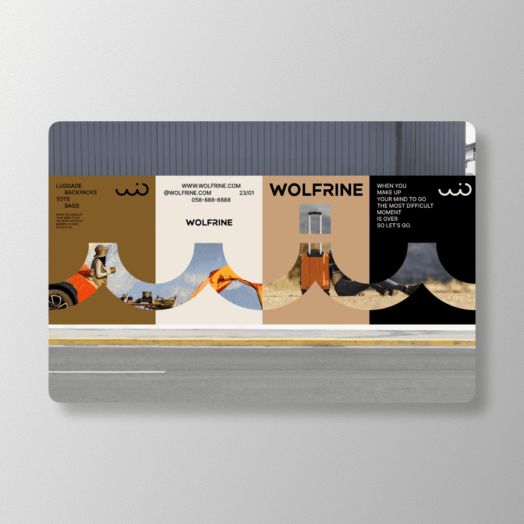
WOLFRINE is a new China DTC luggage brand aiming to shed the “cross-border ecommerce” vibe. We built a premium system in gold and white, with a W+O mark that hints at a rolling wheel. Courage, independence, and exploration. Clean, modern, legit.
Timeline
8 Weeks
Challenges
They weren’t just selling luggage. They were selling belief. “Brave trip energy,” without sounding like a motivational poster taped to a suitcase. On top of that, they needed to look premium and global, not like a fast template brand that changes fonts every Tuesday.
Solutions
Refined positioning around courage and independence, young-at-heart, not “cheap travel gear.”
Designed the W+O symbol as a wheel cue, so the mark feels built-in, not slapped on.
Built a gold-and-white palette that reads premium but stays light and modern.
Created a modular visual system for packaging, hang tags, product cards, and ecom layouts.
Set typography and composition rules that reduce the “marketplace listing” look.
Defined a photo and content direction, airy, bold, exploratory, with room to breathe.
Outcome
WOLFRINE moved from “cross-border product” to “brand with a point of view.” The system made everything look cohesive across packaging, promo assets, and digital touchpoints. The result felt more premium, more intentional, and way more ownable.


// DON’T STOP NOW


