Yeno
Brand Strategy
Brand Identity
Visual Design
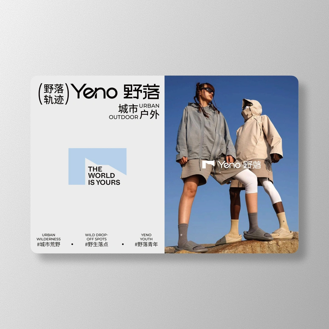
A youth-driven “urban outdoor” startup that wanted to feel legit in both worlds. We built a clean city-to-trail identity, then rolled it out across packaging, hangtags, posters, and content so every drop looks like it came from the same brain.
Timeline
6 Weeks
Challenges
YENO (野落) was trying to live two lives at once. Streetwear energy for city kids, but still believable when the product shows up near actual dirt. The risk was obvious: either it looks like “outdoor cosplay,” or it looks like another generic streetwear brand drop with a mountain slapped on it.
They also needed a system that could scale across sizes, SKUs, and packaging formats without redesigning the universe every time they launched a new item.
Solutions
Built a simple “city-to-trail” system: sturdy lines, modular blocks, and layout rules that stay consistent even when the content changes.
Designed a logo and supporting marks that read fast on packaging, hangtags, and tiny garment labels.
Created bilingual type hierarchy so Chinese and English sit together cleanly, not like two roommates fighting over the same kitchen.
Developed a material-first packaging direction: kraft textures, minimal ink behavior, and bold placement for high shelf contrast.
Set up repeatable poster and campaign templates, so drops feel cohesive without looking copy-pasted.
Defined color and accent logic that can flex per collection, without breaking the brand’s “urban wilderness” vibe.
Outcome
YENO ended up with a brand that can switch scenes without switching personalities. Packaging, lookbooks, posters, and product labels all speak the same language. The system made future drops easier to build, easier to keep consistent, and way harder to confuse with “random streetwear brand #482.”


// DON’T STOP NOW


